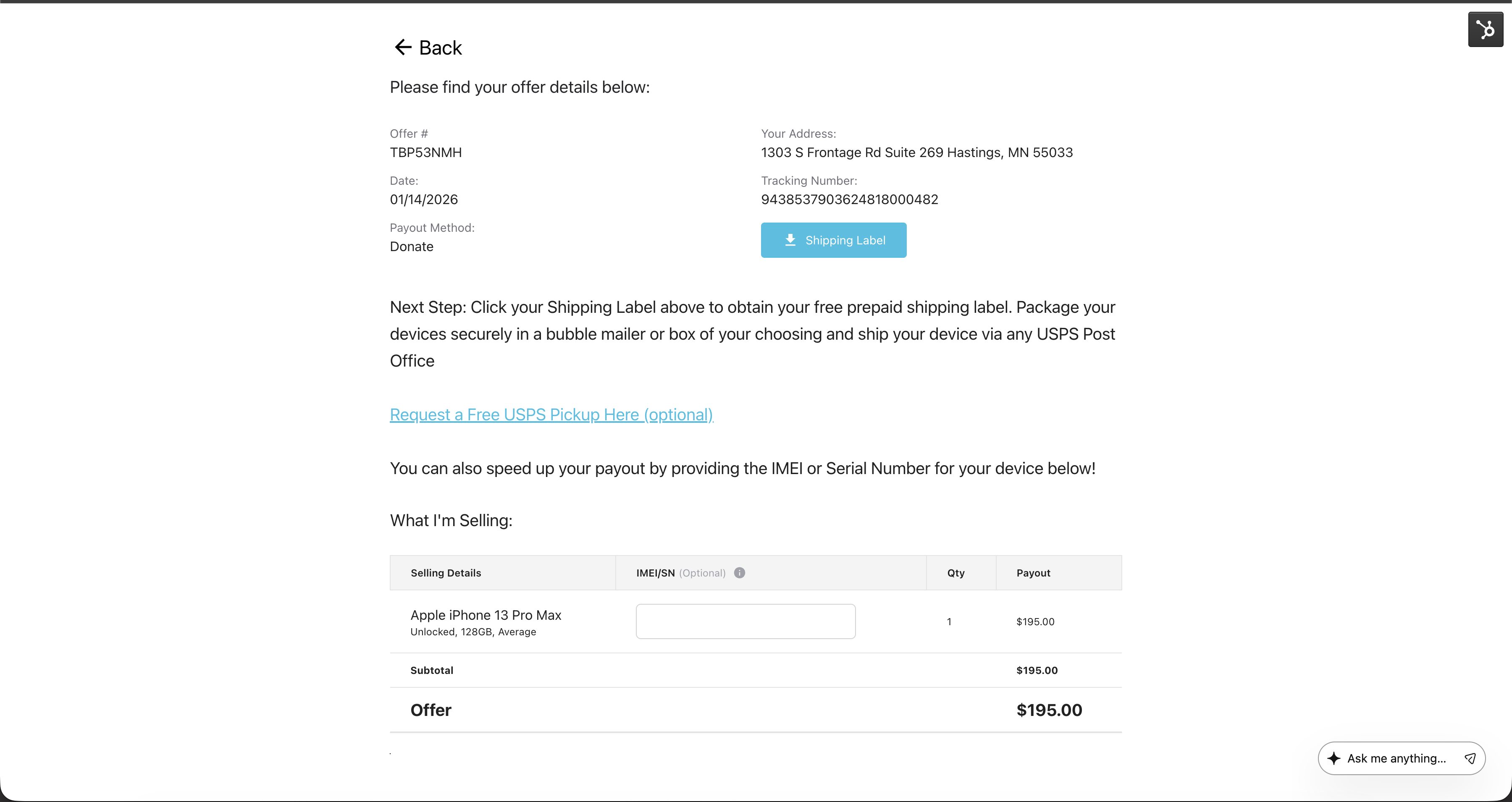
Order Confirmation Screen
The “Back Button” thats seen in the Order Confirmation screen probably shouldn’t be there for user optimization (user accidentally clicks and looses their buyback order and thinks they need to resubmit/restart the process).
Proposal to hide the back button on the order confirmation screen. Relocate and repurpose the button to the bottom of the page with a button that says “Start a new offer”.
Please authenticate to join the conversation.
Upvoters
Status
Scoping
Board
Suggest a Feature
Date
4 months ago
Subscribe to post
Get notified by email when there are changes.
Upvoters
Status
Scoping
Board
Suggest a Feature
Date
4 months ago
Subscribe to post
Get notified by email when there are changes.