Enhance dashboard buyback graphs.
I’d love to see the buyback graphs on the dashboard made more modern and functional. Right now, they take up a large space but don’t feel as useful as they could be.
For example, instead of the current curving lines between months, it would make more sense if the data connected directly between points so it’s easier to understand at a glance.
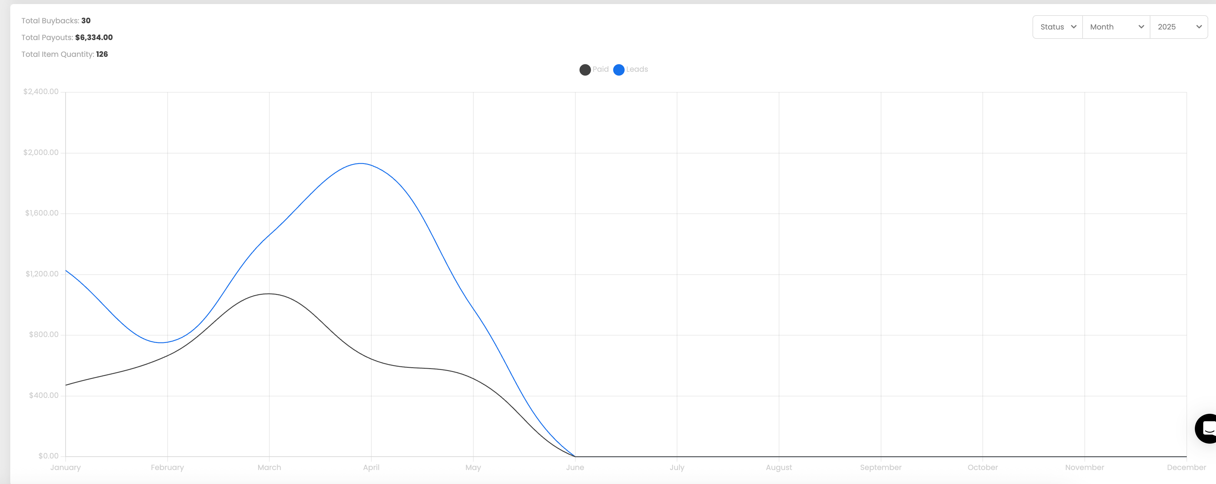
It would be great if the graphs had a cleaner design, showed the data more clearly, and fit better into the overall dashboard layout.
Can you update the buyback graphs to be more accurate, user-friendly, and space-efficient?
Please authenticate to join the conversation.
Scoping
Suggest a Feature
9 months ago
Subscribe to post
Get notified by email when there are changes.
Scoping
Suggest a Feature
9 months ago
Subscribe to post
Get notified by email when there are changes.