Enhance Catalog UX
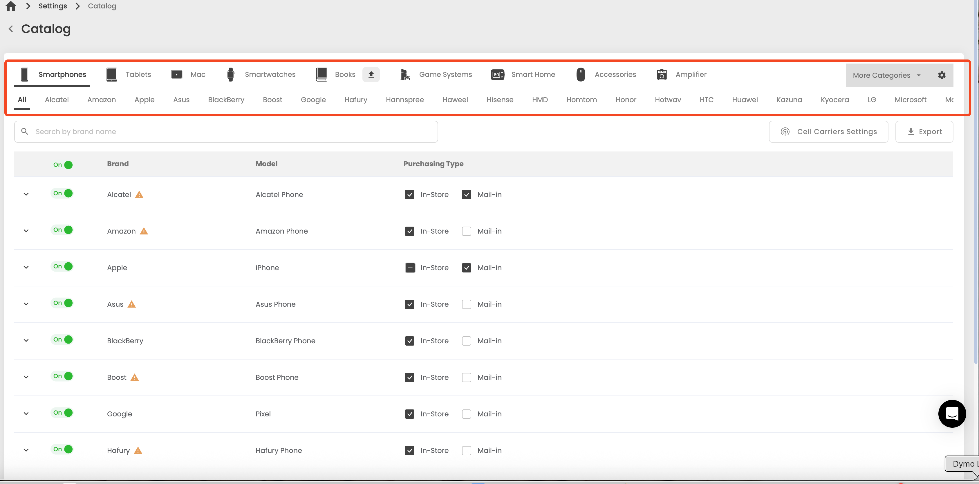
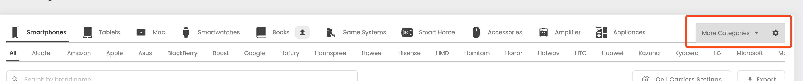
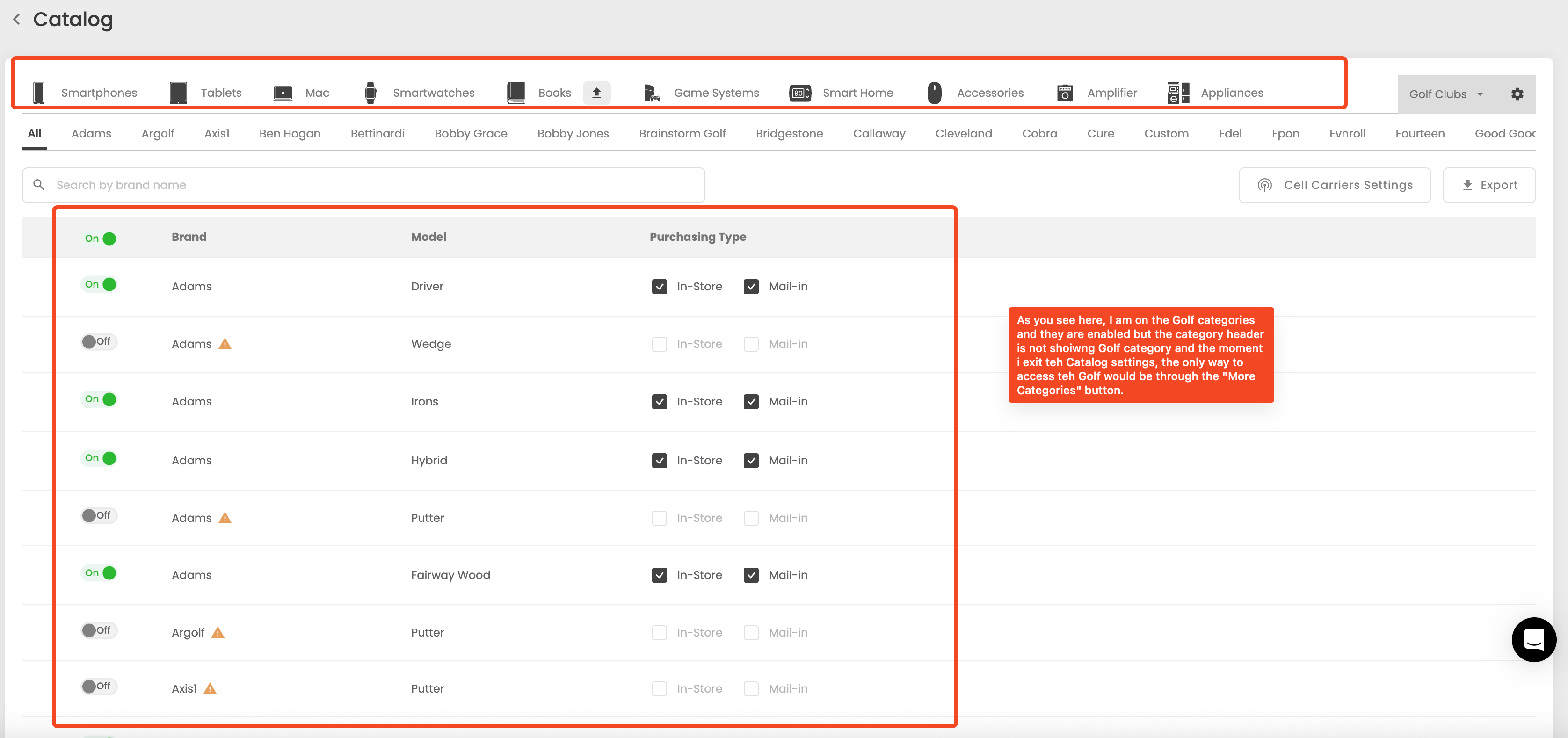
Our catalog interface feels outdated, especially when navigating categories. Right now, if I want to enable something like Golf items, I can find it under “More Categories.” But once I select it, the Golf category doesn’t stay visible in the header — the header is static.
This makes it harder to keep track of what I’ve enabled. It would be much more intuitive if the header updated dynamically to reflect the categories I’ve selected (similar to how it works in the Price Editor).
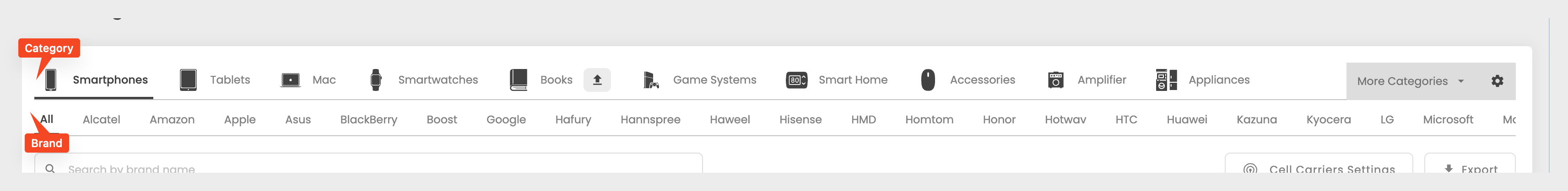
It would also help to add clear titles:
“Category” above the category header
“Brand” above the brand header
Suggestion:
1.) Modernize the UX.
2.) When a user enables an item in a category, the category needs to be visible in the header ( like how we have it in the Price Editor).
3.) Add a title named "Category" for the category header.
4.) Add a title named " Brand" for the brand header.
Please authenticate to join the conversation.
Completed
Suggest a Feature
9 months ago
Subscribe to post
Get notified by email when there are changes.
Completed
Suggest a Feature
9 months ago
Subscribe to post
Get notified by email when there are changes.