Customer Portal Login Templates
Overview
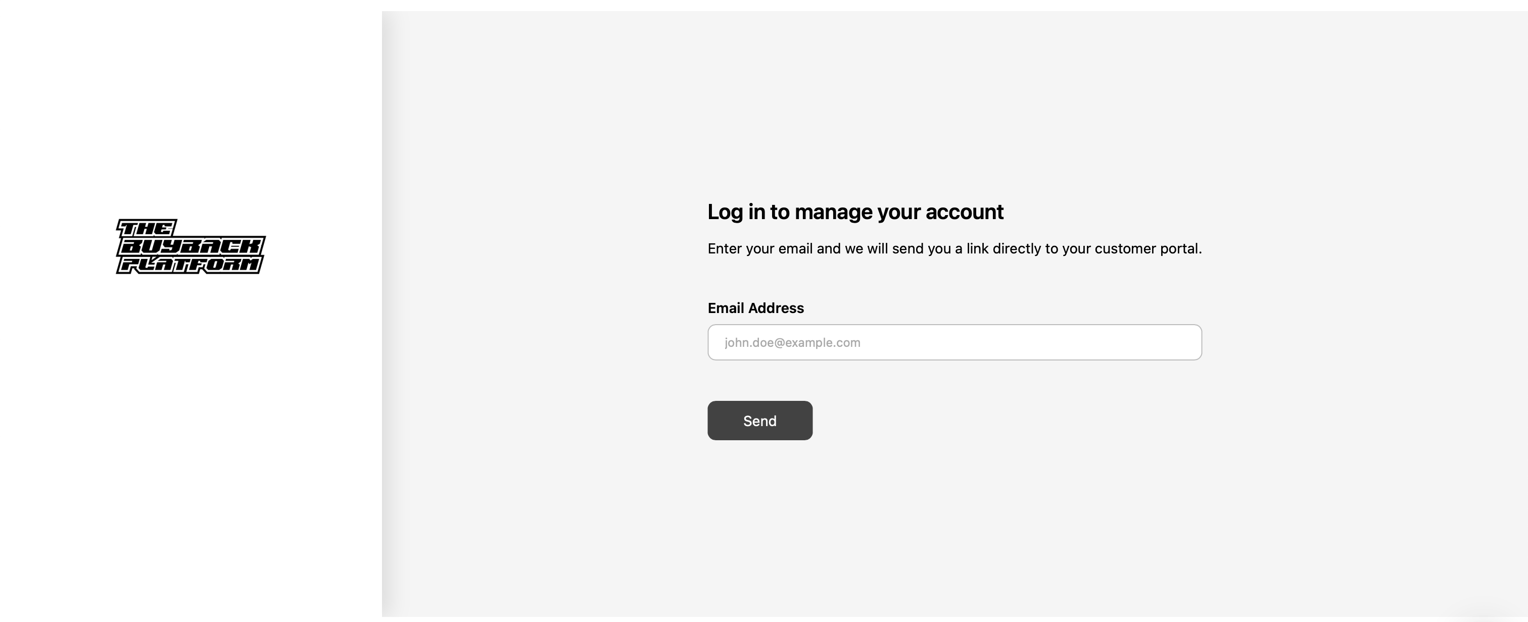
Currently, all brands using the customer portal have the same default login page layout, leading to a lack of differentiation across brands. This request proposes offering multiple layout templates and design variations for the login page so that each brand can choose a style that best matches its identity.
Problem
Uniform Look: All customer portals look identical, regardless of the brand’s visual identity. (besides logo)
Brand Experience: A single style limits each brand’s ability to provide a cohesive experience to their customers.
Engagement Impact: A mismatch between the portal’s design and the rest of the brand’s site can feel disjointed and less professional.
Proposed Solution
Introduce configurable login page templates that allow brands to select from a library of pre-designed layouts and styles.
Template Options
Classic Centered Layout (current default)
Split Layout – Image or illustration on the left/right, form on the opposite side.
Full-Page Background – Brand image/video as background with login card overlay.
Minimal Compact Layout – Smaller form, floating in center with subtle shadow.
Left-Aligned Layout – Form and branding aligned to the left, open space on right.
Customizable Elements
Brand logo placement (top-left, centered, etc.)
Background (solid color, gradient, image, or video)
Typography (brand fonts if supported)
Primary button style (rounded, filled, outlined)
Support text/link placement (e.g., “Need help?” link)
Benefits
Brand Differentiation: Each brand can create a unique look & feel.
Improved UX: Consistent experience with the rest of the brand’s site.
Flexibility: Easily switch templates for campaigns or seasonal branding.
Retention: More professional design may increase trust and login completion rates.
Please authenticate to join the conversation.
Under Review
Suggest a Feature
8 months ago
Subscribe to post
Get notified by email when there are changes.
Under Review
Suggest a Feature
8 months ago
Subscribe to post
Get notified by email when there are changes.